Thursday, 26 March 2015
Campaign which turned out to be a massive disaster.
Scanning and manipulating images
For the animation project, in November, I had to scan in the drawn images I had created in order to create my video. As they were being used in video format only, I scanned them in at 72dpi (if they were to be used in print it would have been 300dpi), however, I didn't think about scaling them correctly. This was a pain when it came to editing the video, as the images didn't quite fit in the frames and I had to scale them and crop them within the editing software. When scanning in the images, I also had to edit the contrast and threshold, to create blacker outlines, as the fineliner hadn't come up as expected. The final scanned in images are below.


Below is also how I cropped the extra bit of the image off, where you could see it was inside my sketchbook.


I then played with the threshold a bit more, but personally didn't like the outcomes, although they may aesthetically please someone else.


Below is also how I cropped the extra bit of the image off, where you could see it was inside my sketchbook.
I then played with the threshold a bit more, but personally didn't like the outcomes, although they may aesthetically please someone else.
I also played around with the idea of using a different colour, or hue. Changing the overall colour tone not only is an aesthetic change, it can also affect the meaning of the image, through the use of colour which can affect the mood.
Wednesday, 25 March 2015
Current Portfolio
My portfolio as it stands now, is not completely related to what I plan to go onto degree level and continue. It doesn't contain enough to do with graphics or editing, which is what I really should have within my portfolio should I wish to continue into professional practice, which I do. It is also limited in what it can show of my work, as it can only show screencaps of most of the work I do, so therefore it will be much better to continue with a digital portfolio as my first priority. To keep in line with current professional practice, I will upload my current work in a blog post to form a showreel.
Evidence for Digital Images - Manipulation and Output
Layering
Layering is used to create composite images and enable you to put multiple images together. You can use it to put images that were not originally together, and create a new image out of them. You can put bengal tigers in the snow if you are skilled.
Feathering
Feathering is when you soften the edges of an image, This is used to create good photo-manipulations as when you layer one image on top of another, you need to blend out the edges so that you can't see instantly that they were not originally supposed to how you are seeing them.
Healing
The healing tool is similar to the cloning tool, in which you sample from other areas of the image, however, it is more 'aware' of what is around it when you paint with it, allowing it to blend a lot easier straight off the bat. There is also the spot healing tool, which is even easier to use as it is very close to automatic, and this is highly used for blemishes on people, over the other tools.
Cloning
Cloning is when you use your current brush, to extract data from a certain part of a photo, and place it onto a different part. The part that needs the other pixels put on top of it, are parts of the photos that require repair, for example, if they have something that needs covering up that is in the image, you can take another part of the image, and get rid of that object/glitch.
An example of when I have used these methods is below.
However the ability to create these false images has an impact on photography being a 'truthful' medium, through everyone now asking themselves whether or not the image you are looking at has been photoshopped. Was that person really with that person or in that place? Is her stomach really that flat? Is her face really that flawless? In adverising, with almost every advertisement being photoshopped now, the whole campaign has been changed to having no photoshop will get you more sales, including 'real' people makes people want to use your product more. In general now, audiences are getting more and more judgemental by anyone who is using photoshop heavily in any images they create. Something with less of an impact on the general population that is created in images is changing the weather with colour and brightness for example, or green-screening people into other locations.
Animation Final Piece - November - Ghosts
Below is the animatic I created. Unfortunately, my computer refused to cooperate with rotating the images.
Sketchbooks - Importance and how I used them
Sketchbooks are one of the most important things in the process of creating works. Having them to record any ideas you have relating to the process and the final outcome, and to put any visual references in, makes them really useful development devices. They are instant visual references and aid a lot when creating good final pieces as when carrying them around, you don't have time to forget any ideas you had related to the project, being able to write them down instantly, It also keeps all of your research in the one place, so it is always really accessible.
Evaluating my own use of them however is a different story. I am still struggling to get used to using a sketchbook constantly, and am trying to find a size of sketchbook I am comfortable carrying around all the time and working in normally at the same time. I don't feel like I am used to keeping them updated constantly throughout the projects and find all of my sketchbooks are pretty sparse, There is more writing by miles than there is visuals, which I want to change in the future when using sketchbooks more. Also, I struggle to develop on paper, I am still partially in the habit of developing these ideas in my head and then forgetting to write them down, then not having any references later on for my work. The more I have gotten into using them however, is notice that using them thoroughly is helping with the development of my work and I can see improvements within what I do and the ideas I come up with for my pieces.
Evaluating my own use of them however is a different story. I am still struggling to get used to using a sketchbook constantly, and am trying to find a size of sketchbook I am comfortable carrying around all the time and working in normally at the same time. I don't feel like I am used to keeping them updated constantly throughout the projects and find all of my sketchbooks are pretty sparse, There is more writing by miles than there is visuals, which I want to change in the future when using sketchbooks more. Also, I struggle to develop on paper, I am still partially in the habit of developing these ideas in my head and then forgetting to write them down, then not having any references later on for my work. The more I have gotten into using them however, is notice that using them thoroughly is helping with the development of my work and I can see improvements within what I do and the ideas I come up with for my pieces.
Wednesday, 11 March 2015
Evaluating and working with video and sound - 11/3/15
When we worked on our first films
together as teams (both within the course and not), I was given the
tasks of focusing on colour correction and post-production of sound.
This meant that when actual filming was going ahead, I wasn't taking
any part of camera control or sound recording at all, nor directing
etc. I was strictly involved in the post-production section. Once our
editor had finished cutting the film together, I was tasked with
sorting out any colour problems we had as best I could, that weren't
able to be fixed during the shoot due to the lack of correct
lighting, or shooting in locations we were not able to use the full
lighting set-up. Unfortunately in some scenes this did not work out
quite as well as I'd hoped it could, as once you have shot a scene,
there isn't much you can do in post if the lighting is slightly
wrong, which goes to show that when shooting you have to make sure,
as much as possible, you are shooting it exactly how you want it to
look, which also shows that pre-production is so important to get
what you want when creating films. The second of my tasks was to try
and correct any issues we had with audio that had been recorded on
location. As we did not have time to do any ADR, this was a struggle.
There was a lot of background noise and hum, but I worked with what
we had and ended up with something that was able to be listened too
clearly enough. When the shoot was happening, I was there to give
some input to how the recordings should be created, both for sound
and video, however I didn't have the final decision, considering I
was not the sound recordist, nor the director.
During the first terms film production,
we had created both a storyboard and a shooting schedule, and used
in-camera editing to make the final product much easier to deal with.
Unfortunately, our shooting schedule ended up pointless, apart from
the order of scenes, with multiple people that needed to be at the
shoot were late. Due to this, parts of our storyboard ended up being
cut out because of tight time frames to create the video. These two
problems put together ended up making the film a lot worse than we
could have created. From this I learned that if you have no structure
to the film production process and no pre production, the end product
is not going to be what you want, and is not going to be up to the
standards you are able to create. Another thing you have to look at
in the process of pre-production is the health and safety aspects of
the filming. This includes things like making sure after you have set
up you leave no trailing cables around the shoot, and if there are
cables running across the area that you mark them out clearly,
preferably with hazard tape or something similar. Another hazard is
the tripod for the cameras and the stands for the lights. These have
to be clearly marked, so that no one accidentally trips over them or
knocks them over, as well as the areas being used for filming being
well lit. When operating lights you also have to make sure that you
don't try taking them down before leaving them to cool after being
turned off, so that no one touches them and ends up getting burnt.
Other things include making sure everyone tidies up after themselves,
and that no liquids get onto any of the electronic equipment, and
other trivial things that need to be kept in mind.
At first, we tried using the camera on
automatic, with the auto focus, however this did not give us the best
image we could have achieved. So after trying a few different shots
on automatic, we changed the camera into manual, and were able to
adjust the focus and aperture to get it looking how we wanted it too.
We used lights as much as we could for the scenes, however the
location was very cramped and the lighting wasn't able to create a
natural looking setting. We tried changing the power of the lights we
were using, and changing the placement as much as we could think of
(forgetting about the height of the lamps, through the panic of time
being short), and physically do in such a cramped area. We looked
into it further after shooting and realised we had our placement
wrong for our setting, and should have moved the lights to correspond
with being above the actors, as we were shooting and evening scene,
and the only lights that would have been used in reality were ceiling
lamps. We also did not have enough lamps to evenly cover the area,
which gave us weird looking shadows, so from now we now know what we
need to change to shoot in areas like that for a similar time of day.
We did however, keep the lighting consistent throughout the film,
even though it wasn't the best looking. We managed to make sure the
same amount of light and coverage was achieved in every scene to make
sure that it looked continuous and not like it was constantly
changing lighting.
From here we started working on getting
our scenes filmed, we did them in order with our shooting schedule,
which was also in order with our film storyboard. We worked in order
of the film story to make it simpler for everyone who was involved,
so that they understood where we were in the filming process easily
as we were filming all in one day in one location. This is pretty
much what you would call in-camera editing. In-camera editing is the
process of filming the entire film in order of every scene, and only
have the final takes, so when you take it from the camera it is
practically edited and complete as a film already. During filming,
making sure you write down file names for both video and sound is
important, so that when you get them off of the devices and into the
edit, it is easy to make sure that you are using the correct files
and in the correct order. Keeping these organised during the filming
makes the editors job much quicker, enabling them to have more time
for detailed editing and fine tuning, such as colour correction and
cleaner cuts. After the recording is all finished it can be removed
from the devices and placed on the editors computer. The editor has
to go through and makes sure that the video footage runs smoothly,
adding extra cuts when necessary, and making sure the audio syncs
with the video. You also have the addition of the sound, and in some
cases background music. Sound can either enhance or distract from
video, for example, when I was completing my transcription project, I
decided to not put any audio with my video, so that you could
concentrate on the messages in the images. Within it there are speech
bubbles in quotes that I wanted the audience to focus on, but because
of the amount of text involved I didn't want them to get distracted
with music. Whereas in comparison, if you look at the inventive
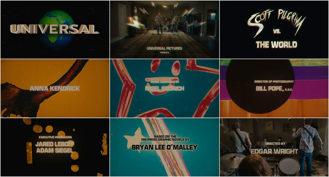
titles project for Scott Pilgrim, the music used compliments the
video itself, adding to it rather than distracting. It also enhances
the meaning of the piece by showing what the film represents in a
more subtle way than explaining it on the screen with text, which
sometimes happens, or even video in some other cases. After all of
the separate editing, including mastering of audio and colour
correction, you can finally tie everything together into one final
product.
Thursday, 26 February 2015
26th February - Campaign
Throughout this class time I worked on finishing my animation.
I had finally settled on creating a typography animation to showcase my idea for the campaign, which is to raise awareness of depression as a serious illness. I looked at different ways I could have created this animation, to get the message across quickly and simply, as if this was an advert. So I decided that typography would send a quick message that was easy to take in straight away, as reading a short message, without any other distractions, would be the easiest thing to concentrate on.
I looked at a few different examples, which are shown below.
and this animation of one of the speeches from Pulp Fiction. https://vimeo.com/47577648
I will be looking at a much simpler kind of this animation, due to the time restraints, and not actually having done much in the way of kinetic typography before this. I now have to decide on a few different sections of text, then create rough storyboards for them.
Tuesday, 24 February 2015
17th - 24th February 2015 - Campaign
When I think about things I really care enough about to create a campaign about the first thing I think about is something I struggle with a lot personally, and that is mental health.
Since this was the first thing that came to mind I started looking for examples of video or animated campaigns and adverts for depression. What I found from looking for these was that I couldn't find any that were actual campaigns to raise awareness, and what I did find of campaigns were posters, not moving image.
I've decided to focus on looking at creating a typography based animation, about awareness of depression. So from here onwards I am going to look for examples of typography animations that are created for other reasons and look at what kind of thing I could create for my final piece.
Saturday, 31 January 2015
Thursday, 29 January 2015
22nd - 27th January - Transcription
I have had a lot of technical issues considering my blog as I have not actually had access to a computer outside of the university, but I now have my own laptop back so I will be able to continue onwards keeping my blog up to date.
During the past week on this project I had really struggled with what I wanted to do. I knew I wanted to create a short film/video, but I had no ideas where to go after choosing Jamie Hewlett as my artist.

I ended up focusing on his work on Tank Girl, and what themes are contained in the work.
A lot of the point of this work was that it was used as an outlet for anything Hewlett and Martin wanted to get out in the open. So I carried on my thought track looking at this, within current world issues. My choice ended up being the subject of feminism, which was highly influenced by Tumblr, which is a highly used medium at the current time for being able to express yourself. A video that really influenced me through my research was 'Oppressed Majority' by Eleonore Pourriat.
During the past week on this project I had really struggled with what I wanted to do. I knew I wanted to create a short film/video, but I had no ideas where to go after choosing Jamie Hewlett as my artist.
I ended up focusing on his work on Tank Girl, and what themes are contained in the work.
A lot of the point of this work was that it was used as an outlet for anything Hewlett and Martin wanted to get out in the open. So I carried on my thought track looking at this, within current world issues. My choice ended up being the subject of feminism, which was highly influenced by Tumblr, which is a highly used medium at the current time for being able to express yourself. A video that really influenced me through my research was 'Oppressed Majority' by Eleonore Pourriat.
I have ended up with a final idea to be shot tomorrow, which will be posted on Saturday.
Saturday, 10 January 2015
Thursday 8th January - Inventive Titles
During this session I focused on brainstorming ideas for the two sequences I have to create. For the film title sequence, I struggled to decide between two different films. I am still uncertain, but have got two ideas.


I have also developed further into Withnail & I with more brainstorming and have to do the same for Scott Pilgrim vs. The World.

For the second title sequence I have decided to stay with the original theme of a news sequence. I haven't yet got any complete ideas, but have done a small amount of brainstorming on the topic.

From here I need to develop these brainstorms into more structured ideas and create storyboards to portray these.
Thursday, 8 January 2015
Tuesday 6th January - Inventive Titles
The introduction to this project involved looking at a lot of film title sequences.
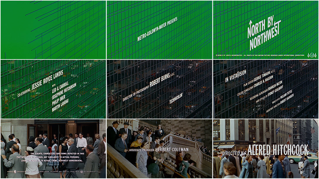


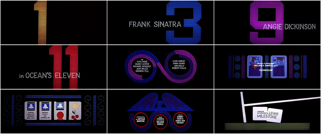


The main creator we looked at, was Saul Bass. Saul Bass did a lot of title sequences for Hitchcock's movies, as well as many other famous titles.
Saul Bass is one of the most well known title sequence designers, and his style comes out in all of the work he creates. Psycho is my personal favourite of his title sequences, as well as probably his most famous.
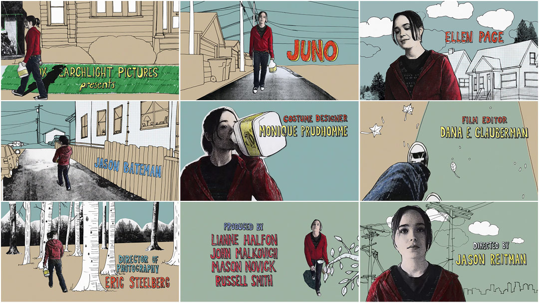
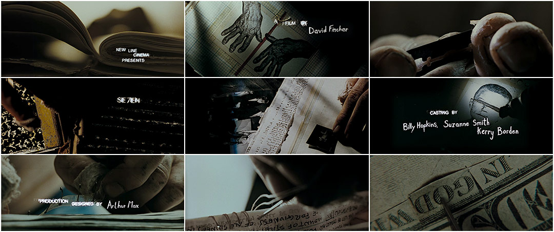
Other title sequences we looked at were:
Juno
Se7en
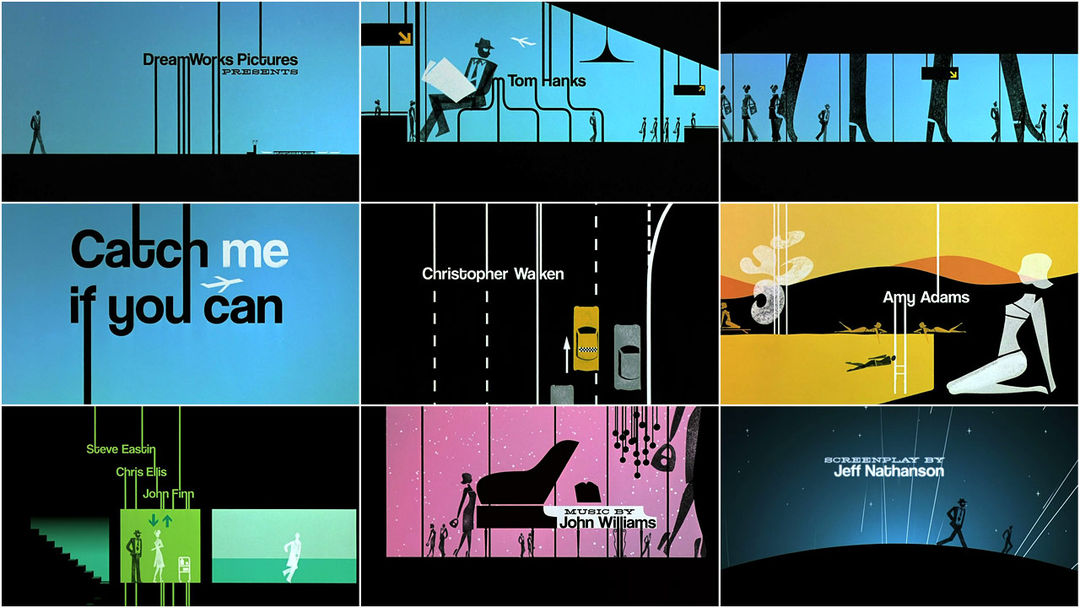
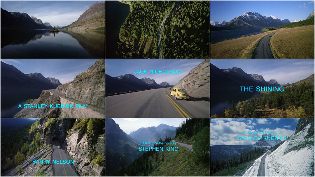
Catch Me If You Can
Trainspotting
The Shining
When I was looking at the different title sequences, I realised that in a lot of them, I really didn't pay any attention to the actual text that was appearing on screen. For the majority of them, the eye is drawn away already with the video or background contents before text even begins to show on the screen. A really strong example of this is The Shining. I watched the title sequence a few times more, to take more notice of the text, and see how it had actually been put into the sequence. It is a really bland font, alongside being in a cool colour, which doesn't exactly draw the eye.
After this I looked into films I would like to make my title sequence for. These included:
Scott Pilgrim vs. The World
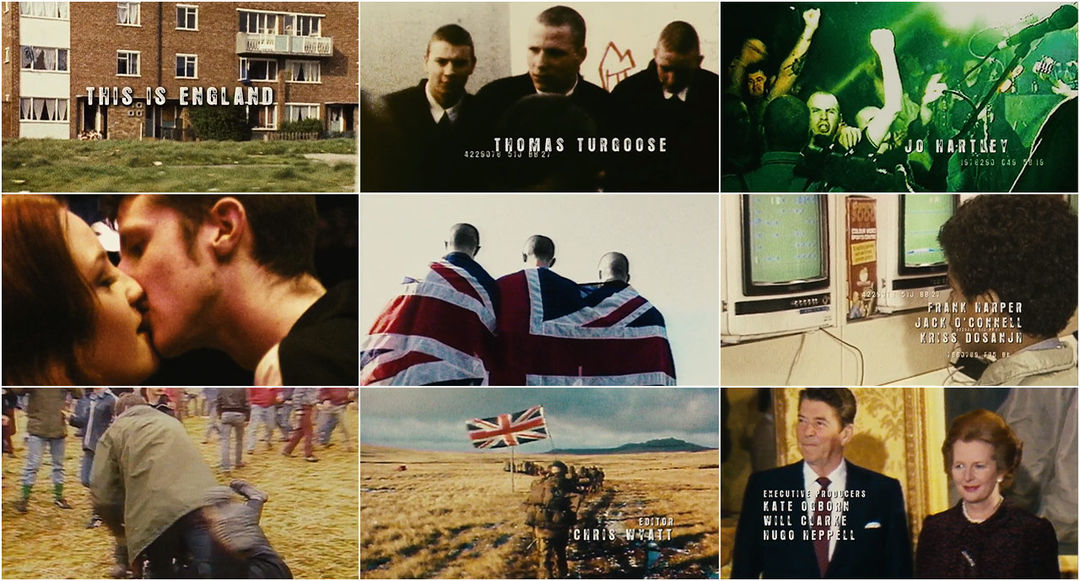
This Is England
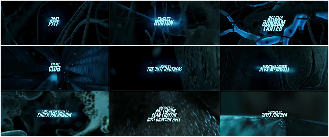
Fight Club
Withnail & I
I decided that I either want to work with Withnail & I or Scott Pilgrim vs. The World for my recreation, so I am going to develop ideas for them both before choosing.
Subscribe to:
Posts (Atom)